Kindred Pharmacy Services
Not a ground-up rebranding effort, but an update to the look and feel of Kindred’s Pharmacy Services, these pieces were designed for the pharmacy sales team.
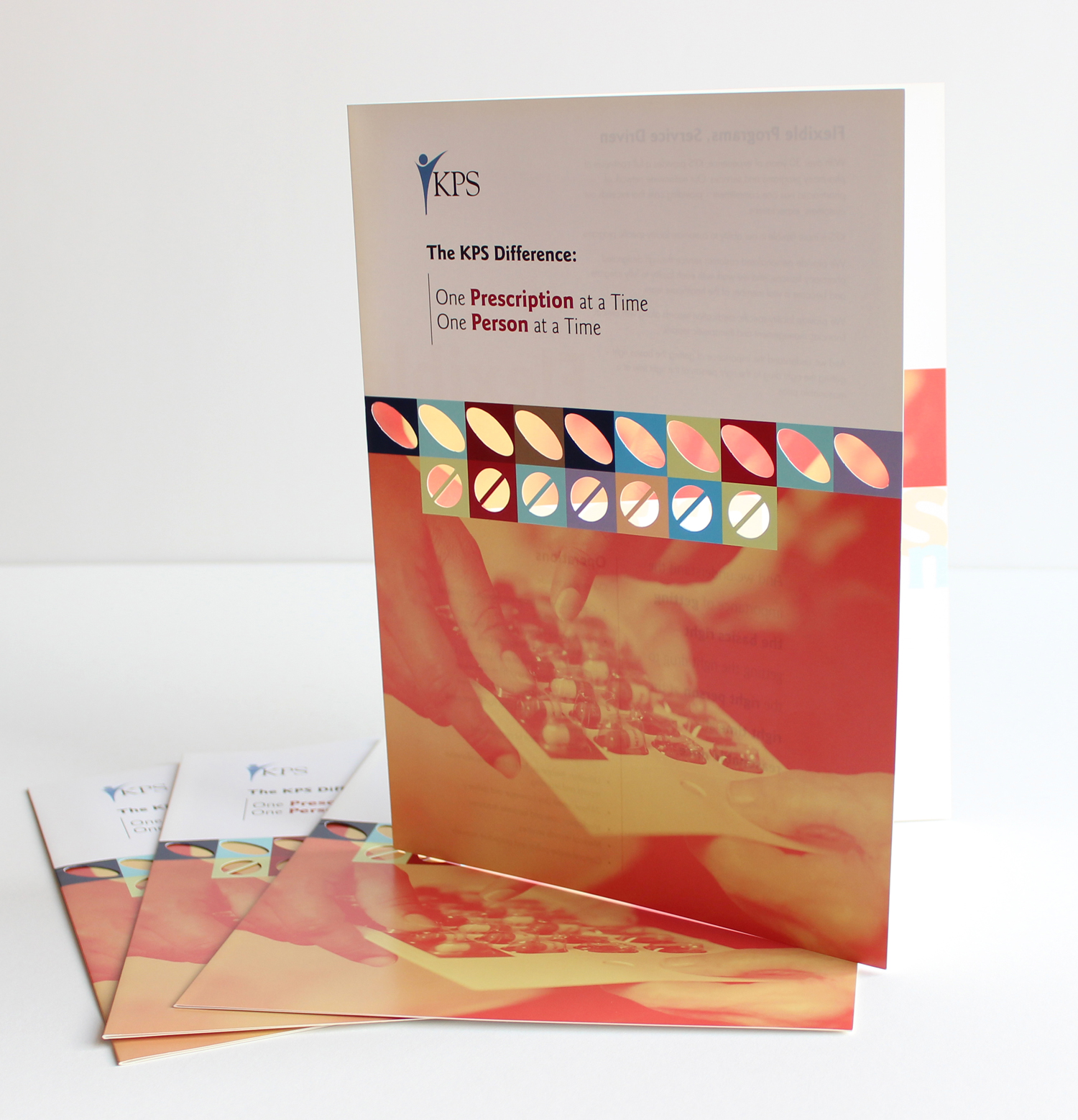
As the team looked to increase their penetration into non-Kindred hospitals and skilled nursing centers, they wanted to make sure their leave-behinds were going to get read.

The bright, inviting colors are eye-catching, and the die-cuts provide the peek a boo effect that entices the holder to crack the piece open. This system was then applied across all branded materials throughout the line, from traditional print elements such as postcards to all their trade show booths. This look and feel remained until the division became an external company named PharMerica.