Kentucky Shakespeare Identity
As a board member of Kentucky Shakespeare, I recommended that the company update their logo, print materials and website. The previous logo which had been used for years was not distinctive, was poorly drawn and had too many competing elements in the mark.
After several failed attempts to create a piece without the iconic Shakespeare portrait, I relented, and decided to see how little of the portrait I could use. By cropping aggressively and placing the face off center, I was able to create the impression that Shakespeare is peaking out at the viewer, giving him a cheekier, less elevated vibe that seems appropriate for both a writer of comedies and for a free outdoor festival.

The mark is easy to reproduce in many mediums, down to a large gobo to project on the immense outdoor theater curtains and is extremely recognizable. I also worked with them for several seasons to design their season and event posters, playbills and outdoor street banners.

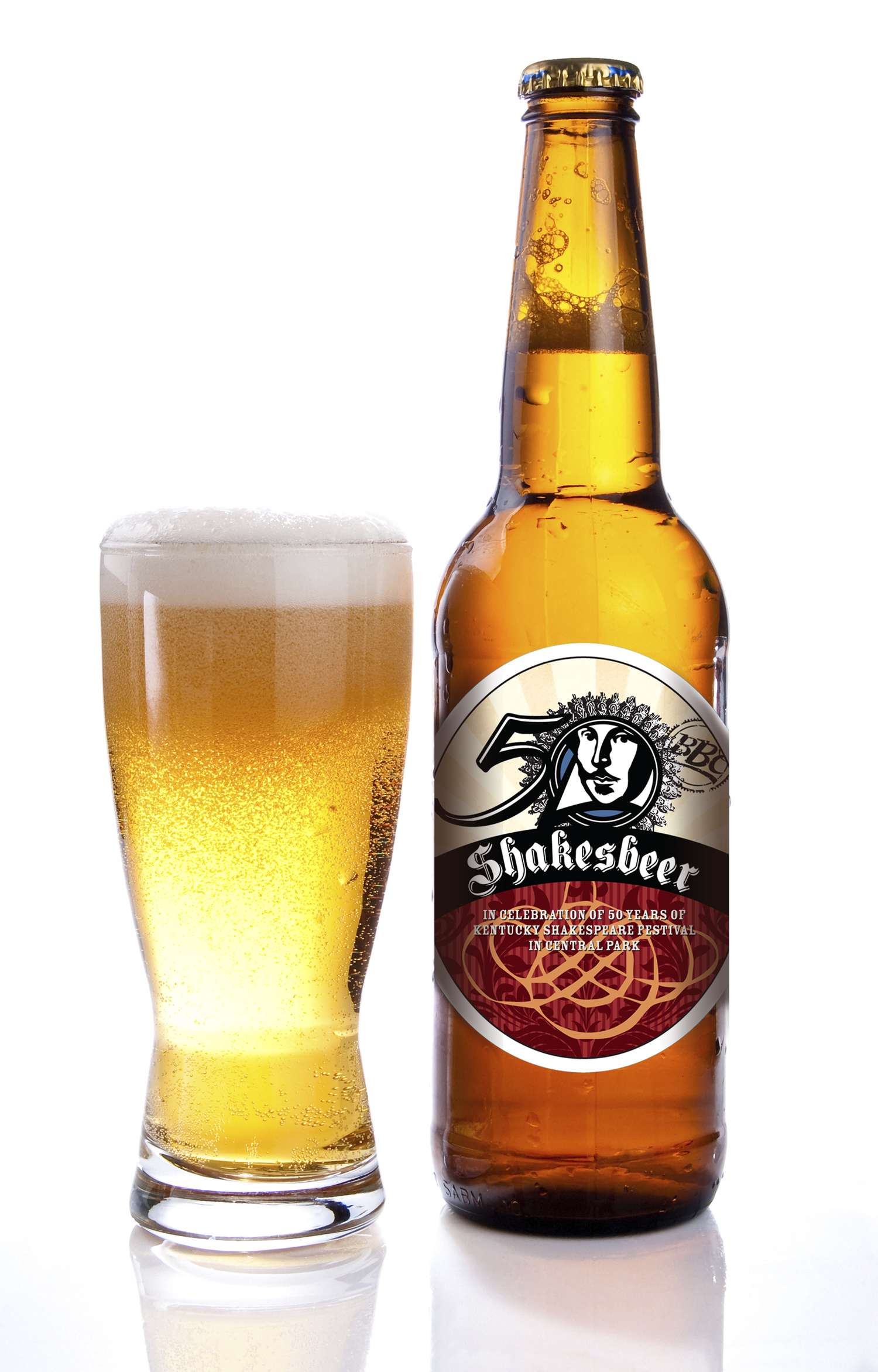
For their 50th anniversary, I designed a special logo which was used as a special mark for that one year. In addition, that year we partnered with BBC to create a special brew we called Shakesbeer which was sold at Central Park.